


Do you like it served raw?

Hi,
Today’s piece may be of interest to those of us who like to boast about our statistical model outputs. For quick presentation purposes, I used to copy and paste my raw model results. On a good day, when I felt motivated enough, I would re-type them using a nicer font and even create something resembling a table. When I really cared about how my outputs looked (see: when I was writing my thesis), I even played with LaTeX. But there’s a nicer and relatively painless way to achieve some aesthetic standards without sacrificing hours of your life: gtsummary package💫. And, as they say, a good programmer is a lazy programmer.
As always, you need to install it first.
### Install and load packages ###

install.packages("gtsummary")
install.packages("broom.helpers")

library(gtsummary)
library(broom.helpers)
Let’s use in-built flowers dataset to quickly illustrate its functionality:
### Explore the data ###

data(iris)
head(iris)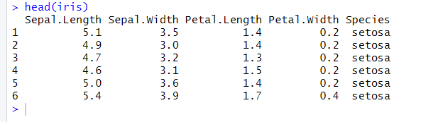
If we want a quick look at some of the descriptive statistics, we can use tbl_summary() function. We can pick values we are interested in, e.g. mean or median, by playing with the statistic argument:
### Display some of the descriptive statistics ###

iris %>% tbl_summary(include = c(Sepal.Length, Sepal.Width, Petal.Length, Species),
                    statistic = list(
                      all_continuous() ~ "{mean} ({sd})",
                      all_categorical() ~ "{n} / {N} ({p}%)"
                    ))
We can also forget about linear model assumptions and causality issues for a second and use the tbl_regression() function to nicely summarise the model output:
### Run and summarise a linear model ###

model_iris <- lm(Sepal.Length ~ Sepal.Width, iris)
tbl_regression(model_iris)
Pretty, isn’t it 😇?
Have a good day,
Agnes
PS: Here is the survey in which you can tell me what R topic you find particularly confusing and why you want to learn it so that we can shape this space together!